

How To Design Windows App
Designing for PC Apps
4 Core Concepts for Designing PC Interfaces and their Implementations
![]()
Nowadays, a ton of design references exist for mobile apps. There are plenty of online portfolios you can visit for quick inspirations, and millions of apps (According to Quora, there are more than 5000 apps released each day) you can easily benchmark.
However, when it comes to PC apps, your references become very limited. What are the main trends? What does the user expect? What are some common technical constraints you will have to work around? You will immediately realize that it is much harder to answer these questions for a desktop environment.
I would like to share some of the lessons I've learned while designing a PC app, and add a bit to the limited amount of resources out there. Hopefully, this article will help you understand a little more about the main expectations present in a PC environment and how to design for it.
1. Start with the System UI
There was a time in which I believed that every bit of my design had to be new and creative. I would try to use different interactions from the products that already existed for every single page, in order to 'show-off' my skill as a designer. Guess what happened? Nobody understood my design.
As one of my mentors used to say, the best designs usually are 99% similar to what we already use, with 1% of a tweak to make it stand out from the rest.
This applies to the PC environment as well. Remember that though there may not be many PC apps out there for you to use as a reference, your users will probably be very familiar with the system UI, and expect many of your components to act in a similar way.
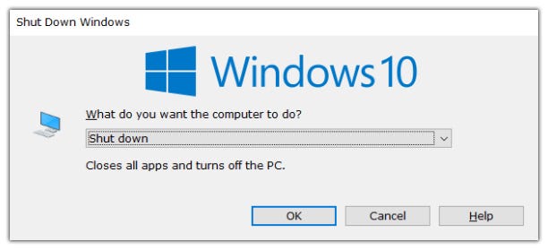
For example, I was trying to design for a mode change within the app. I wanted to make sure the design for both the Windows and MAC apps were consistent, but also were not hard for each OS user to use.
I learned that though both Window and MAC apps usually use toggle buttons on the menu bar as select mode metaphors, MAC buttons will usually take the form of a set of buttons masked to a rounded rectangle, while Window buttons will usually be represented with icons that are not boxed. I adopted this UI so that each OS user would be able to intuitively understand how the component works.
Also, did you ever notice that most Window prompts have the OK button on the left side, while MAC prompts place the OK button on the right?
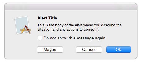
It may seem like a small difference, but it's pretty likely a Windows user will become frustrated if you put the confirm buttons on the right; no matter how sensible that may seem for you. You don't want to make them think every time they press a button, because chances are there will be a lot of them.
Taking note of small patterns like this will ensure that your users will be able to use the basic components of your app, so they can focus on learning the really important interactions.
Any app needs time and dedication to understand completely, so don't frustrate the users with the small stuff.
On a different note, you might want to not only use the system components as a design standard, but also consider using the components directly in your app as well. Using the system UI reduces the overall size of the app, and shortens the development / design cycle.
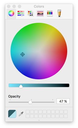
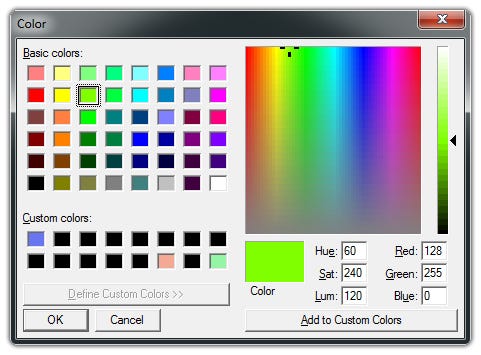
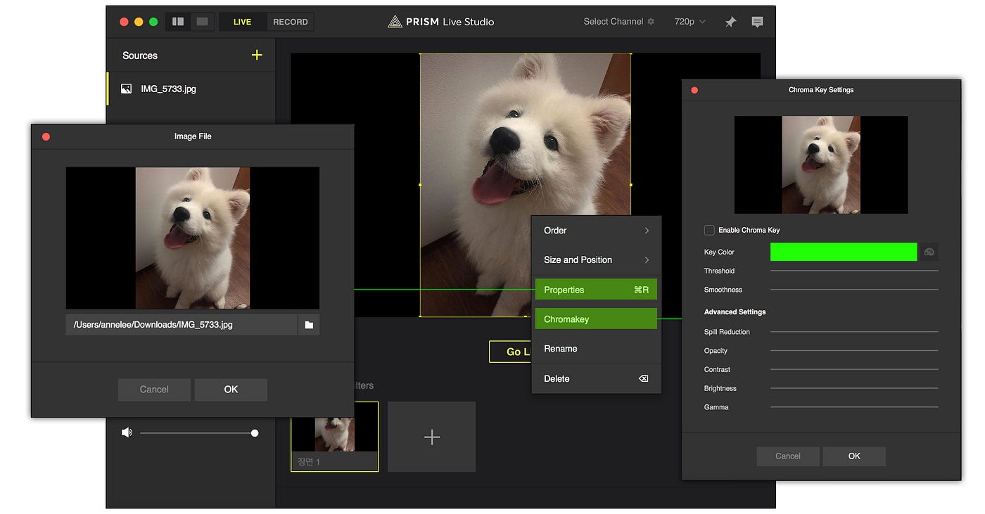
For example, I usually use the system color picker for my PC apps because they come with great functionality that is already built-in. I believe making efficient process decisions are also an important part of design. So unless the color picker is a really important part of my app and I want to add a lot of features to it, there is really no reason for me not to use it.
I know it takes time to research each environment, and especially if you are a long time MAC user like me, it's tempting to just use the components that you are familiar with. However, just as hard it is for you to understand and adjust to another interface, your user will also be pressured to learn every single interaction all over again. So take the time and explore the two (or more) OSs, as the results as a designer will be rewarding.
2. Design for Less Steps
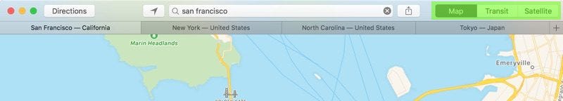
In the world of mobile, you have a limited amount of space to work with. That's why the mobile design community quickly adapted multi-page designs.
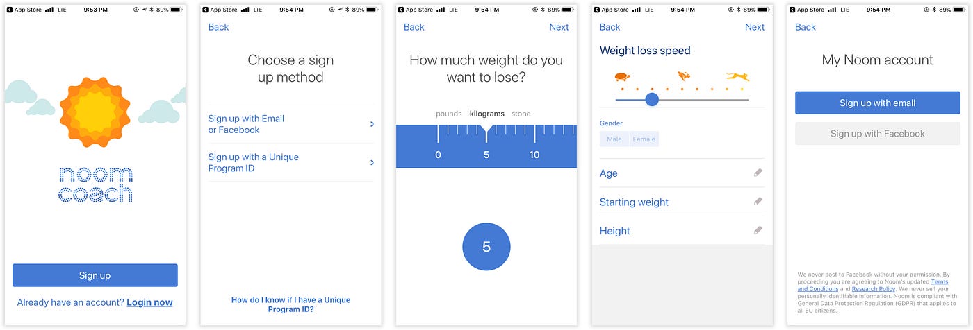
However, you will quickly realize that paging does not work as well when designing for a PC. Paging is not only a uncommon design pattern in this context, but also will result in an inefficiency of space. Remember that the PC is larger than a mobile device, so considering that each step usually has only 2 to 3 options at most, your designs will feel like they take up a lot less space than they should in proportion to the screen.
A way around this would be to increase the number of options per step, and decrease the number of steps total. In the example above, you would probably want to reduce the flow into two steps : Sign up, and customize options. The customize options layer would have steps 3 and 4 combined together. This will fix the scalability issue.
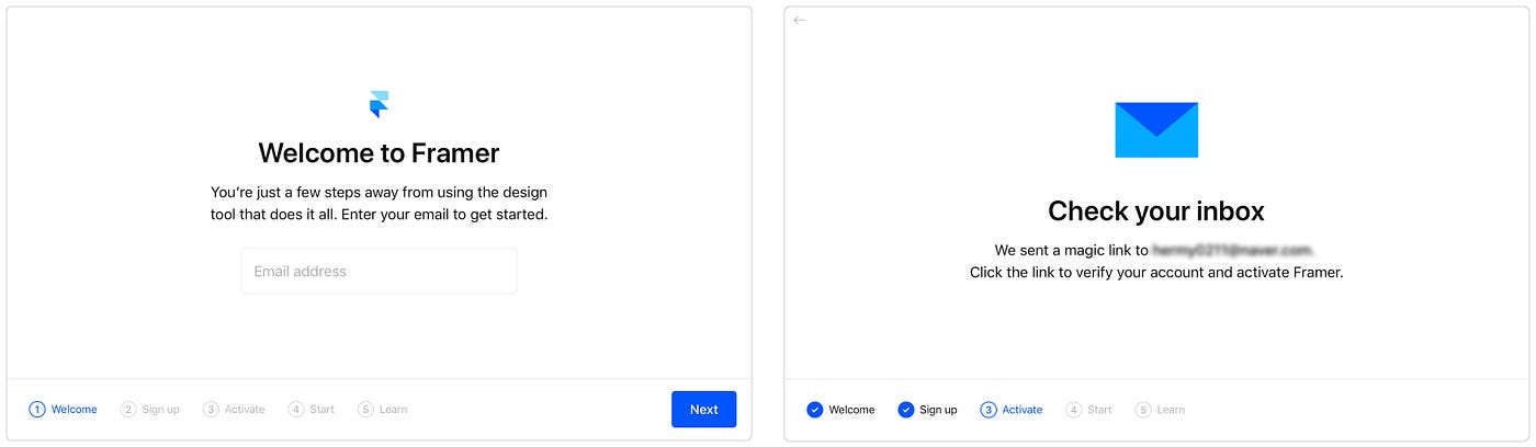
You could also do what Framer did : Keep the paging and add a bit more text to each screen. However, this may not always be an option, as including text just to fill up the screen may not always be a good design choice.
The most common pattern, as dull as it may seem, is to use a popup. Have the user left click an object to reveal a menu, and for each feature, design a separate popup.
And if you have too many steps and don't want 10 popups crammed up on your user's screen (In most cases, the maximum number of depths you will want to express with a pop up is 3), try using these patterns out there that you can use as 'half-steps'; steps that exist but feel like they aren't there.

These patterns reduce the need for excess paging and popups, resulting in a better design. Feel free to include as much of these patterns as possible in order to optimize your steps effectively to the PC environment.
3. Design for Shortcuts and Menus
Another crucial part of designing a PC app that most people don't realize at first is to make sure that all of your important features have keyboard shortcuts. Your users are probably so accustomed to shortcuts like CTRL + C, CTRL + V that they will automatically assume they are supported in your app. Make sure that your shortcuts are also visually represented on the screen, so the users know which shortcuts they can use.
One tricky thing about designing shortcuts is that you can't map multiple actions to a single shortcut for the MAC OS. For example, you won't be able to have Command + C do some sort of copy function on one area (e.g. Copy text), and then do a different type of copy function (e.g. Copy an object) when a different type of object is selected. Keep in mind that all commands have to be exclusive of one another.
Also, you have to remember that all PC apps have menus.
Once you're finished updating your design, make sure all of the menus above stay in sync with your new design, so nothing will send down an error.
4. Design for Flexible Sizes
The last key to designing a truly well functioning PC app is to make sure that your designs are scalable to custom size changes. Remember that all MAC and Window apps have a 'Full Mode', and aside from that your users will probably want to adjust the width and height to fit their needs.
Make sure that you have minimum and maximum sizes defined, spliters placed where needed, and a description of what happens when a user opens a popup when the app is in full mode.
How To Design Windows App
Source: https://uxplanet.org/designing-for-pc-apps-4554d8a0aa85
Posted by: mashburnguideare.blogspot.com
0 Response to "How To Design Windows App"
Post a Comment